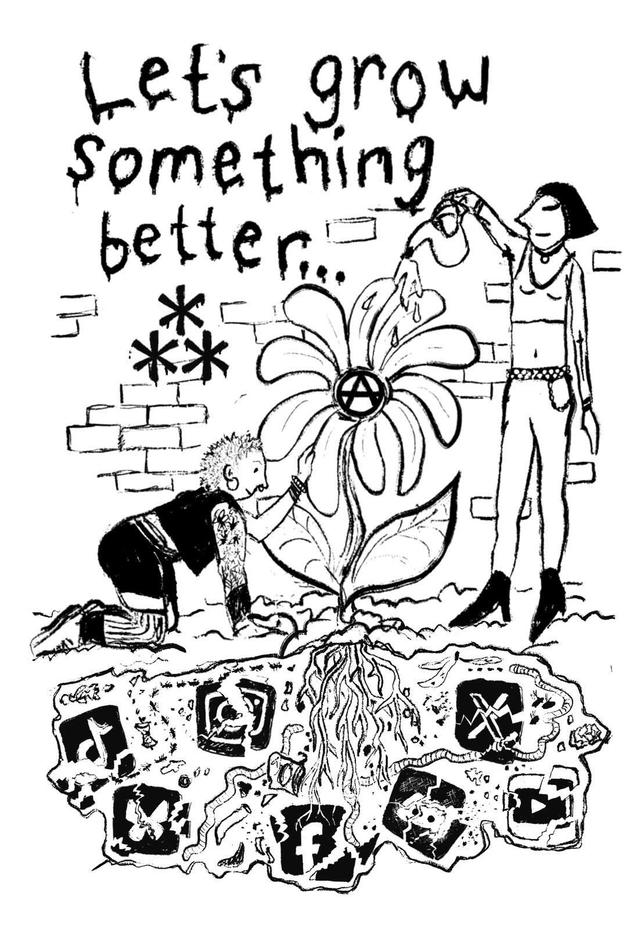
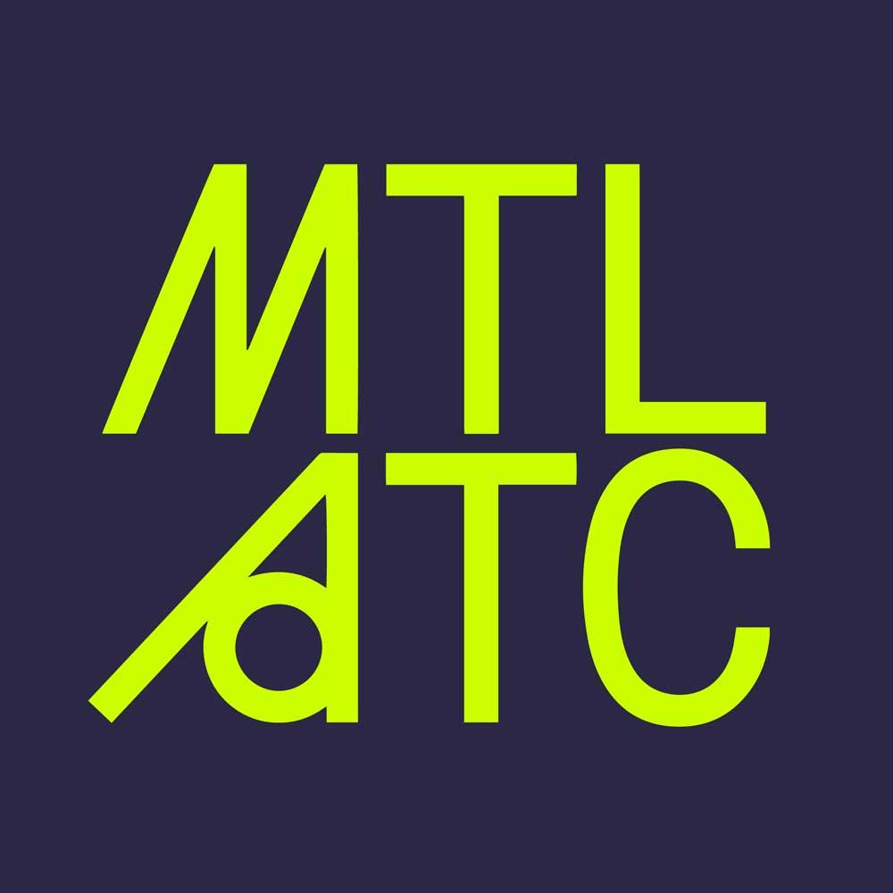
Brand: Montreal Anarchist Tech Convergence
Typographic logo and brand ID for an annual tech conference in Montreal.
2024
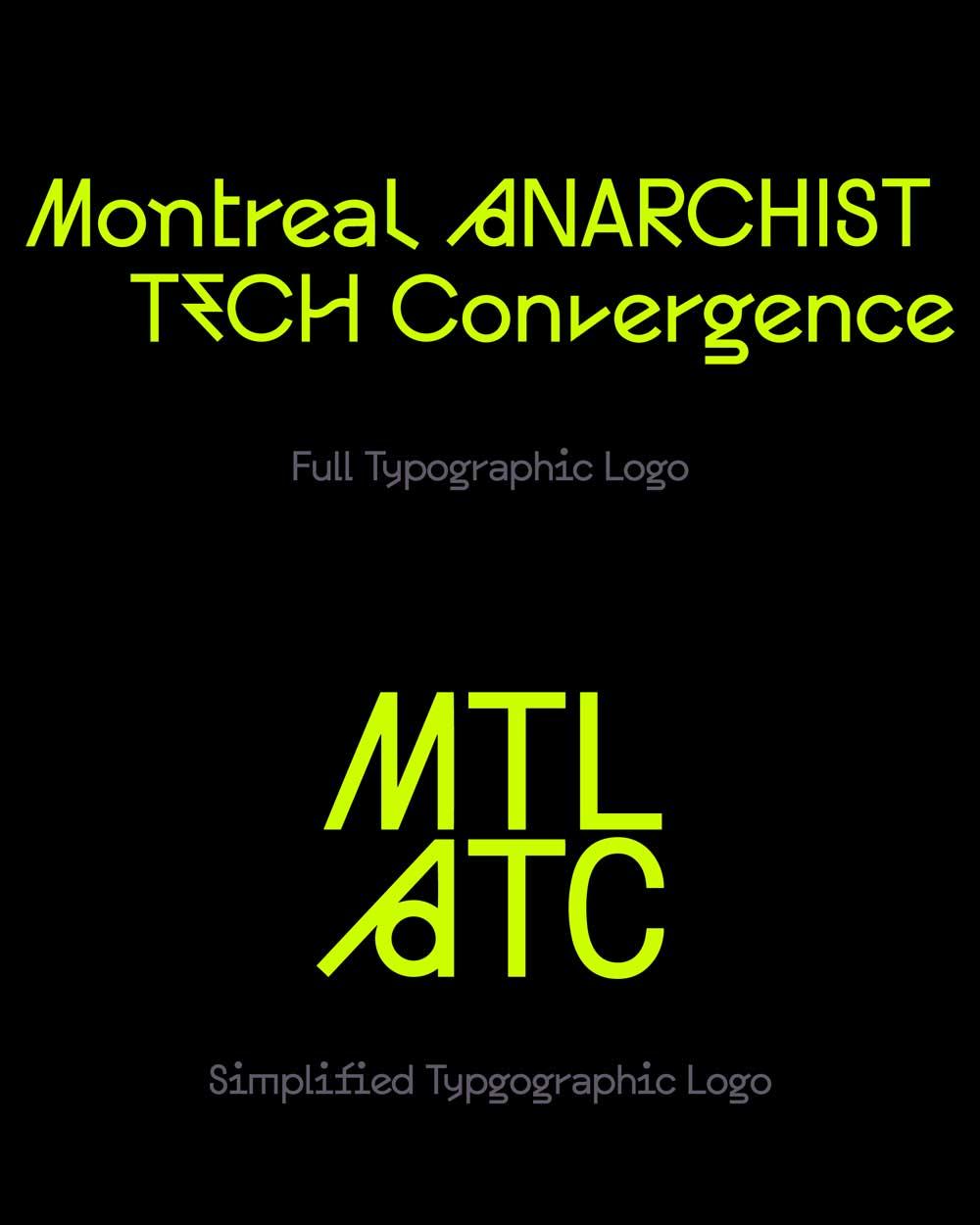
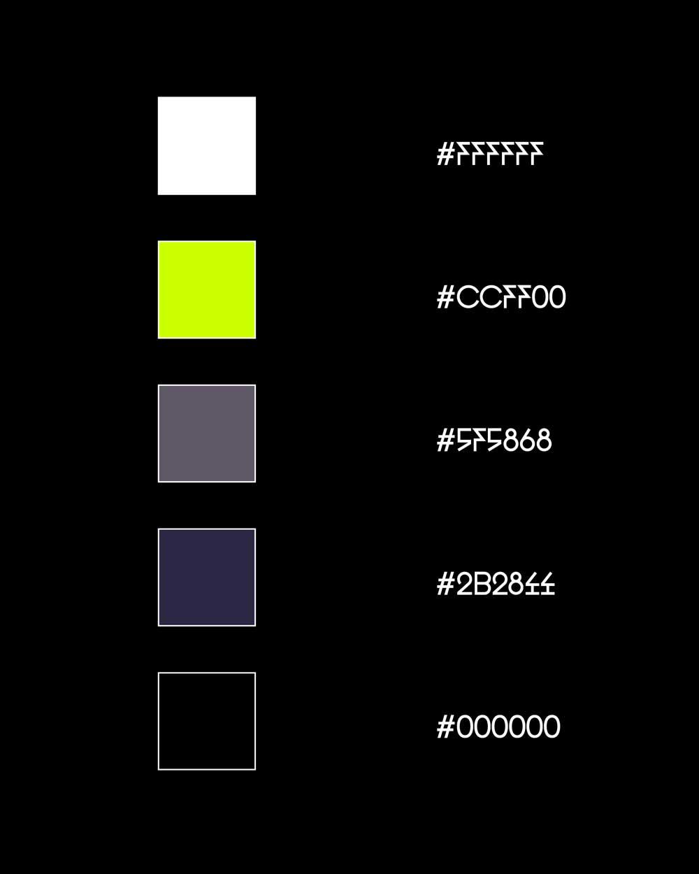
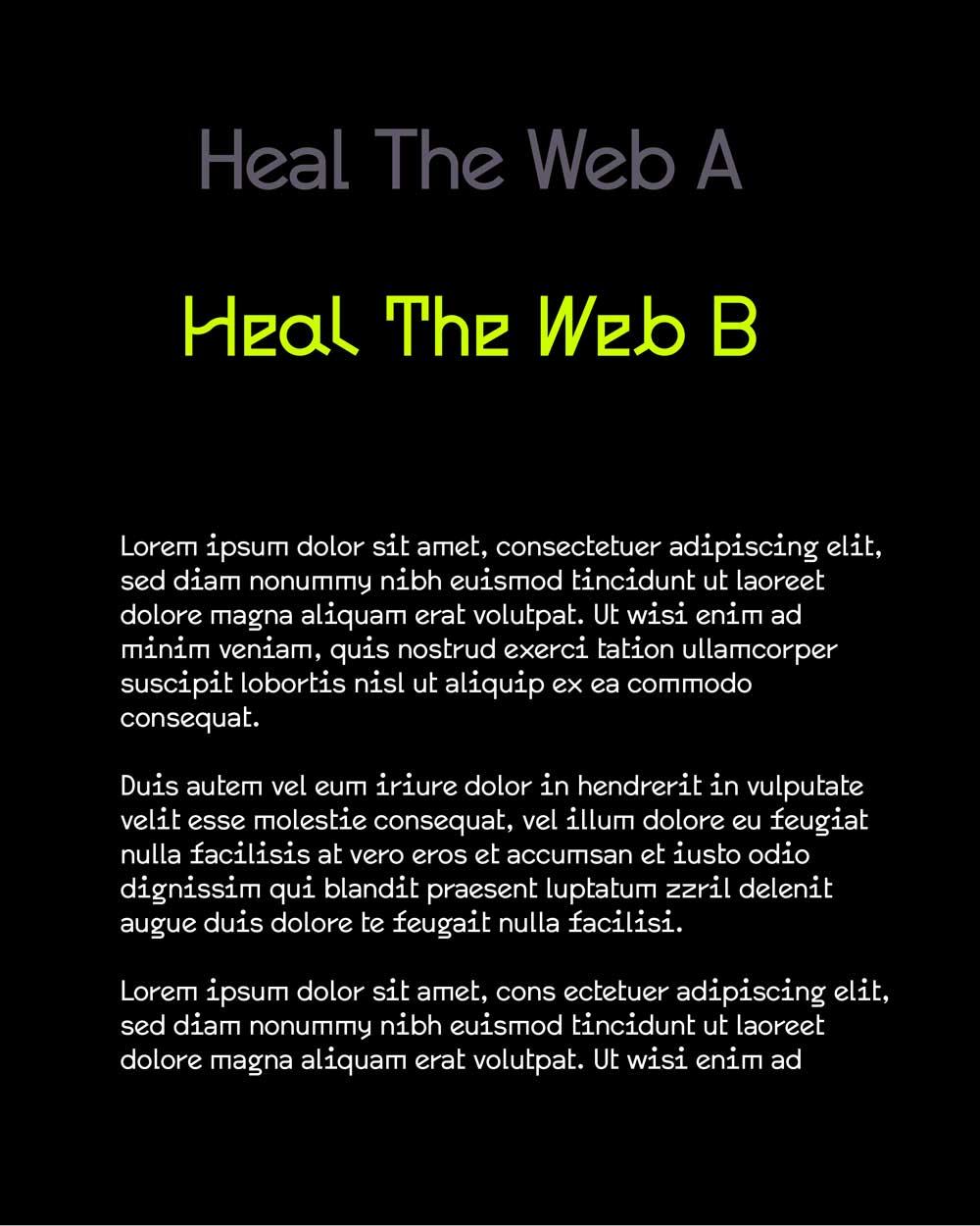
For the first year of the Montreal ATC, I selected striking typography and colours that evoked the high-contrast vintage computer terminal look, but with a contemporary twist. For the type logo, I enlisted the help of an experimental and open-source font called "heal the web" - very on brand for this optimistic and tech-focused event. I especially geeked out over the super brilliant and funky "A" - which in the logo stands for "Anarchist" and evokes the inverse of the classic circle-A anarchist logo "anarchy is order" (but here, the circle is inside the A!)