Brand: Résonances Massotherapie
Logo and brand package created for an independent massasge therapist in Montreal.
2025
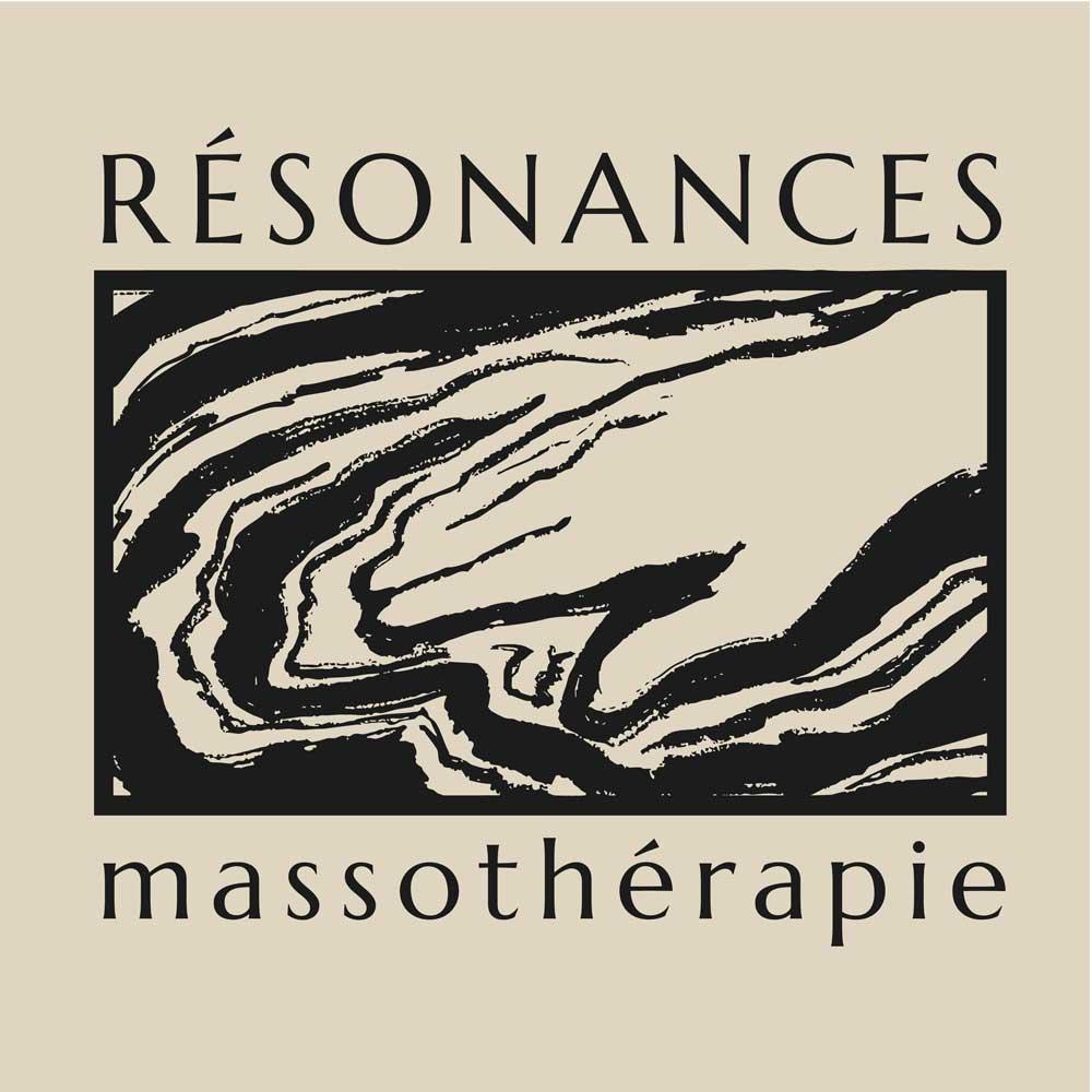
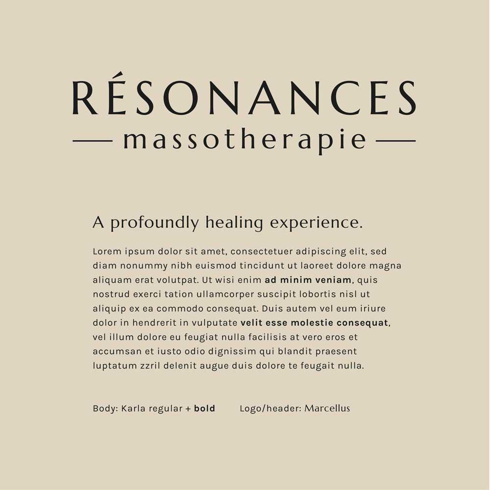
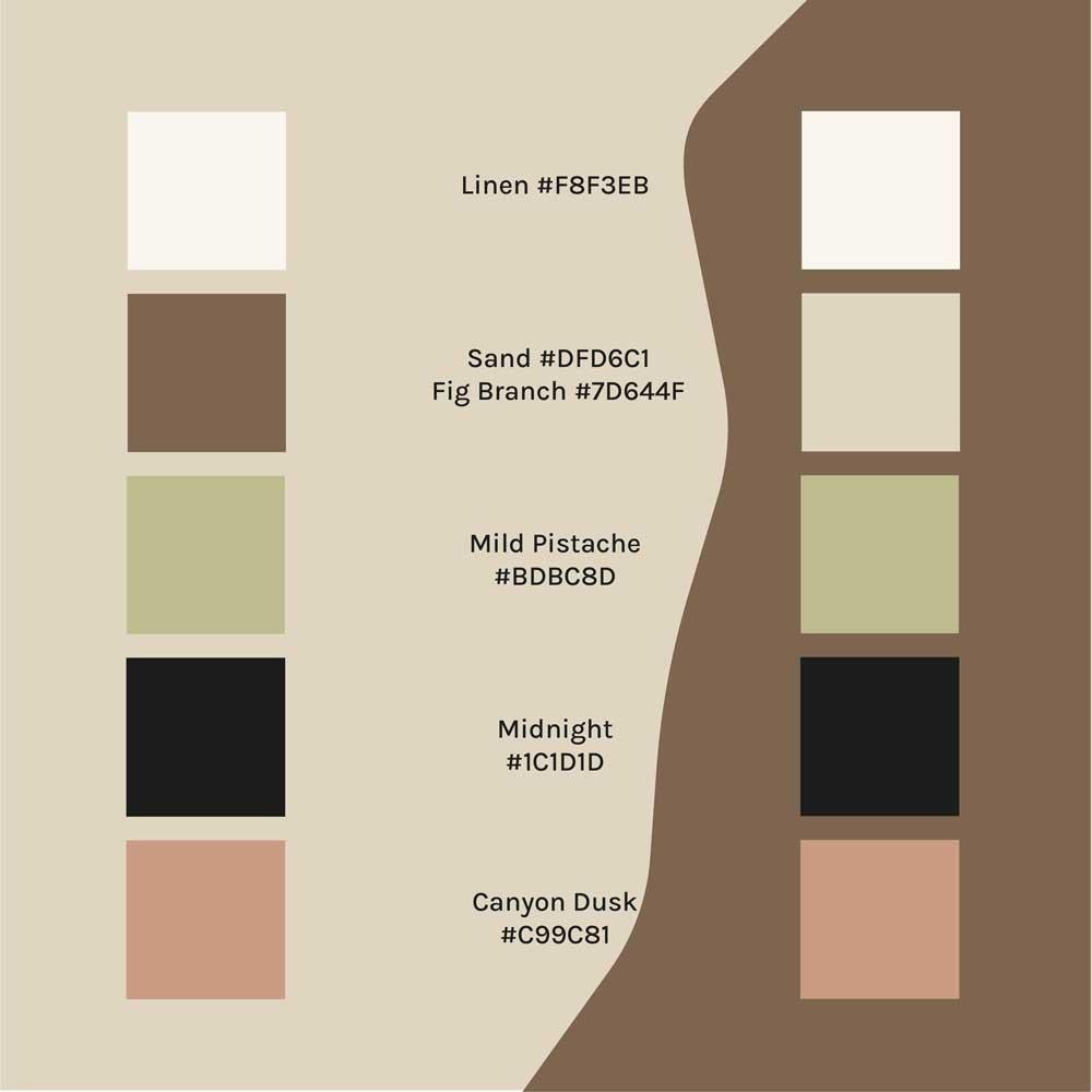
Emily contacted me in 2025 looking for a logo and identity for her independent massage therapy practice – something she could use on her website and business cards to give her practice a coherent and professional aesthetic. She expressed an affinity for browns and warm neutrals and liked the idea of her logo having more of a "hand drawn" look, but otherwise didn't have many ideas about what she wanted.
Using the name of her practice "resonances" as a jumping off point, I drew up a semi-abstract, woodcut-style logo that is meant to evoke both a hand massaging skin and ripples in a pond – the benefits of massage therapy and self-care resonating outward to benefit the whole individual. The fonts chosen convey trustworthiness and professionalism, while the warm colour palette and hand-drawn look of the logo keep things from looking too austere or clinical.